Neogov
2019
Government Jobs
Helping job seekers find meaningful work in the public sector.
About GovernmentJobs.com
GovernmentJobs.com is a leading platform connecting job seekers with career opportunities in the public sector. Serving thousands of government agencies across the U.S., the platform is designed to promote transparency, equity, and accessibility in hiring. Its mission is to help people find meaningful work in service of their communities—making it easier for agencies to attract talent while empowering individuals to pursue purpose-driven careers in government.
Project Background
Competing for talent has long been challenging for state governments. The biggest threat to the public sector is the reduced interest from prospective job seekers. We set out to improve job seekers’ experience in order to become more attractive to the right candidates.
My Role
UX and research lead responsible for UX strategy, research, and presenting findings and design decisions to stakeholders, as well as mentoring 2 junior designers new to design thinking and UX research methods.
Key Internal Stakeholders
CEO
Product Owner for Insight (NEOGOV’s Applicant Tracking System)
Product Manager for Insight
Lead Developer for GovernmentJobs
Head of Marketing
Design Manager
Timeline, Scope & Methodology
UX and research lead responsible for UX strategy, research, and presenting findings and design decisions to stakeholders, as well as mentoring 2 junior designers new to design thinking and UX research methods.
May 17 – June 14 2019 | < 1 month
The research and design plan included gathering quantitative data and resident knowlege, user interviews, competitive analysis, design ideation and iterations with tight feedback loops, and 2 rounds of usability testing.
The focus was on the job seeker/applicant going through the experience of searching for jobs, up to the point of deciding to apply.
Internal Discovery
Because of the short timeline, we identified methods that could be done quickly and in-house while we worked to get interviews and usability testing set up with representative users.
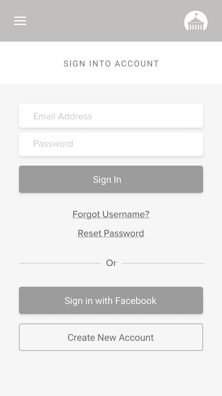
I met with 3 members of Applicant Support to get an understanding of the types of calls they get from job seekers. It was certainly surprising to hear just how many calls they received on a daily basis regarding login issues.
The system did not specify what symbols were accepted when creating a password, the placement of the password reset link felt hidden to the user, and resetting passwords on mobile was not as compatible as PC/desktop. On top of this, we learned users were locked out of their accounts after one failed attempt!!
Data Gathering
I collected data on site usage from Google Analytics, reports on applicant support cases from Salesforce, and utilized recently published research findings shared in NEOGOV’s Job Seeker Report.
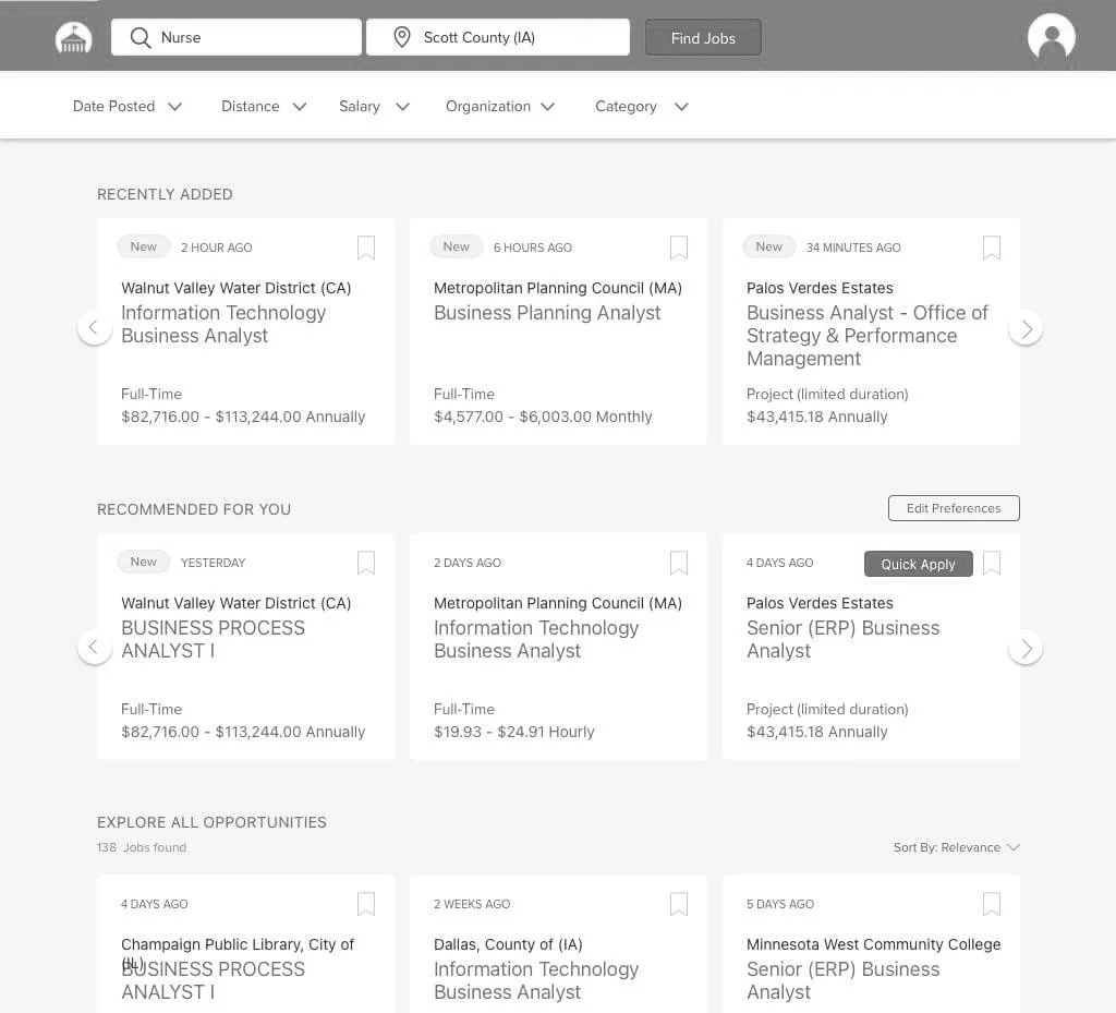
It was interesting to see how much emphasis was placed on design and improvements to the landing page, when over 36% of users were going directly to the search results page. This, on top traffic data, suggested that many job seekers were initiating their search from an external search engine.
Competitor Analysis
We researched and discussed patterns identified across direct and indirect competitors. Some strengths we identified across a number of competitors was a clear tone/voice as well as strong hierarchy and IA that pulls users focus to the most relevant information despite layouts often being high context. Several competitors appeared to be far more employer focused than job seeker focused, which was not something we wanted to emulate. After doing this, we did a feature inventory to check how we stacked up against direct competitors and identified areas of have high value and lower organizational effort.
User Interviews
In total, 12 representative users were interviewed. Many were done in conjunction with usability testing, contextual inquiry, and A/B Testing. Some discussion topics for persona validation / invalidation included:
• What prompted you to begin your job search?
• What’s important to you when looking for a job?
• What (if anything) drew you to work in the public sector?
• Can you recall the last time you applied for a job? What was that like?
Insights
Prior to design, we were able to identify patterns to better develop the Persona and understand motivations, pain points, and needs that would drive ideation:
Job Seekers look at multiple job boards on a regular basis and from their phone most often. They apply to multiple places, not just one.
Public Sector Job Seekers are attracted to the idea of public service, the benefits packages offered and the idea of this being a long term or lifetime job.
Top 3 priorities – location, compensation, position title (but this also relates to experience level).
Job seekers want to apply to many jobs to increase their chances of getting hired. They are visiting multiple job boards and agency sites regularly.
Job seekers don’t always apply right after finding a job they want to apply to. Instead, users will often save it in some way and return to it later.
Contextual Study & Usability Testing on the Current Site
Participants often did not notice the filters on the side, but found the filters useful once seeing them.
Most new users thought the ads at the top were actual jobs postings/part of the GovernmentJobs.
All new users expected to answer questions when clicking on the questions section.
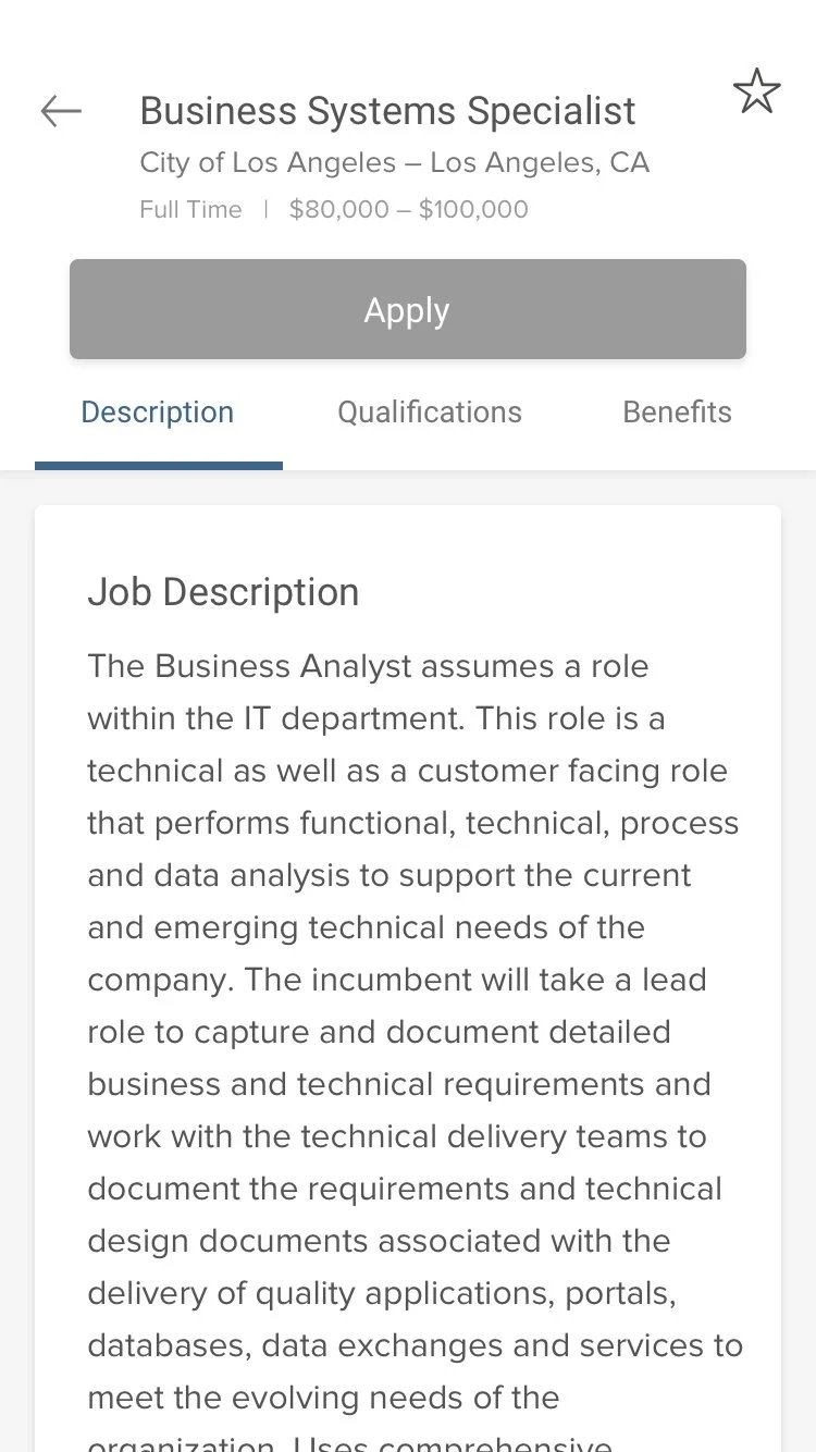
Several sections included in the job posting page was either not relevant to the job seeker or confusing.
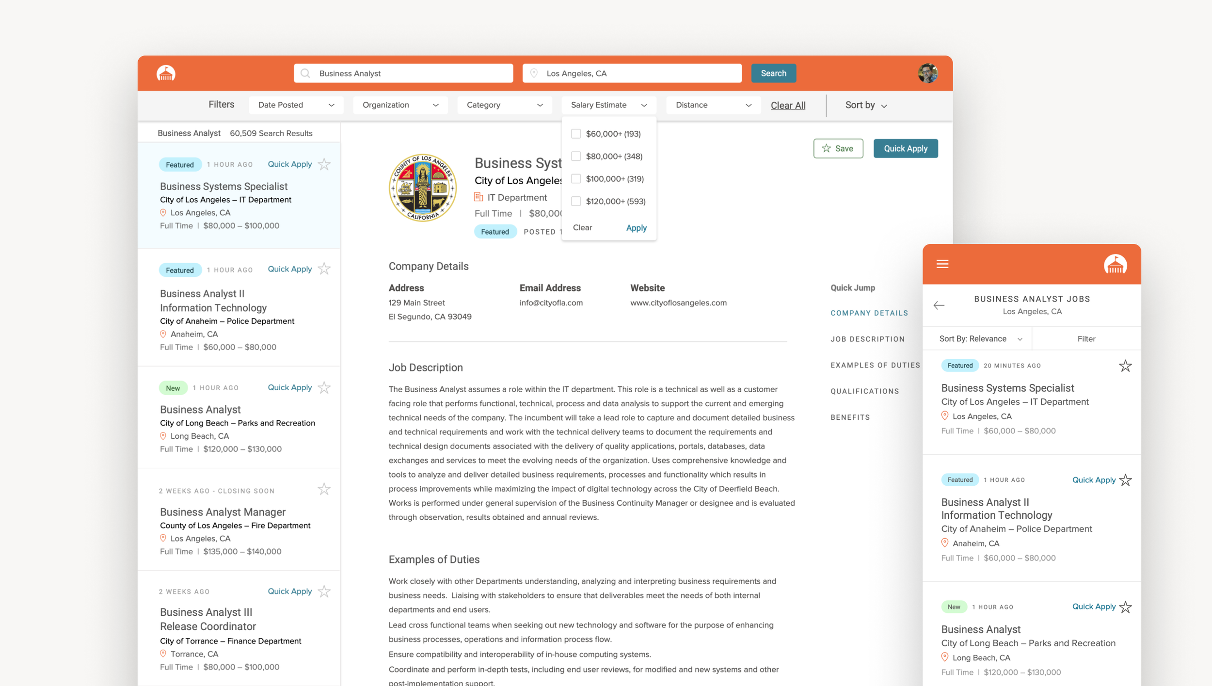
Original site
Design, Testing, & iterating
From pen to paper sketching, to low-fi wireframes, to mid-fi prototypes, we went through several rounds of design and testing. We had a solid starting point through our discovery research, competitor analysis, and usability testing of the existing site. We made sure to introduce several changes up front to do usability testing.
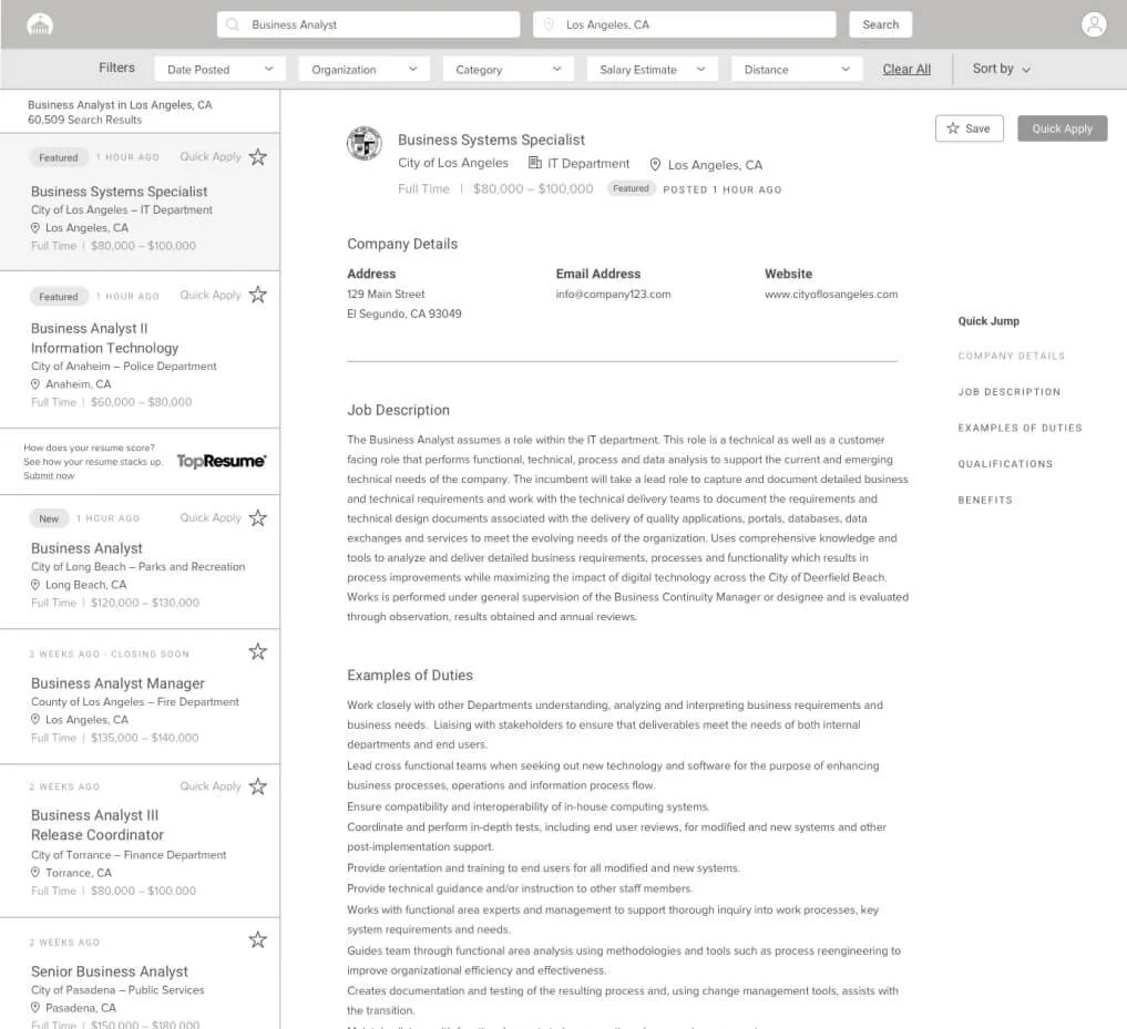
Use continuous scroll or try “load more” instead of pagination. 20% participants clicked on page 2 . 80% started a new search or changed search criteria once reaching the bottom of the screen. 0% went past page 2
Update job posting criteria for job posters in order to improve the experience for job seekers.
Include “new” tags.
Quick apply when there are no supplemental or agency wide questions.
Side-by-side layout
Moved ads from the top. disperse them throughout the left sidebar.
Removed job descriptions from the search results section.
Usability testing
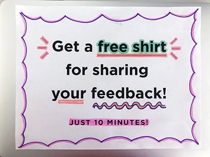
Under a tight deadline and limited budget for incentives, we made some signs, grabbed some swag, and took to a local mall for some gorilla testing
Presenting to Stakeholders
We identified and worked with several allies prior to presenting. We knew what questions to expect and were ready to back up our recommendations with data. The design and presentation was well received and we were well prepared for an open discussion with decision makers using THEIR language.
Personal Reflection
I truly enjoyed being given the opportunity to work on this project and collaborate with some amazing people. It’s opened the doors to new cross department collaborations and helped communicate the value of UX process and design in an organization that is still developing and maturing its design team.
Challenges
• Recruiting representative users with no budget and no access to customer info.
• Convincing Marketing and CEO that ads at the top were a serious user issue.
• Navigating office politics and identifying allies as a new hire.
• Getting access to data as a “Designer.”
“Our hiring process is just so much more efficient. The feedback I’ve received from applicants and new hires is that it is very easy to navigate through. The interface is very easy to use for people who are not technologically savvy, and just the aesthetic and the layout is just clean. We have nothing but praise for governmentjobs.com. ”